UX – Pilonidal.org
UX Design project: rebuild Pilonidal.org as a responsive site with an information architecture.
First UX Design project – the rebuild of Pilonidal.org. This site was about 5 years old from last rebuild and badly needed an update to be responsive. It also needed a content refresh and top to bottom review of the overall content strategy.
I started with a set of basic user persona’s based on 15 years of knowing the users and what question they were going to ask. Luckily, the site has been active since 2000 and grew out organically as users wanted information, so a gap analysis wasn’t necessary.
Then I defined a user path, what road users traveled on their journey, what tasks they needed to perform.
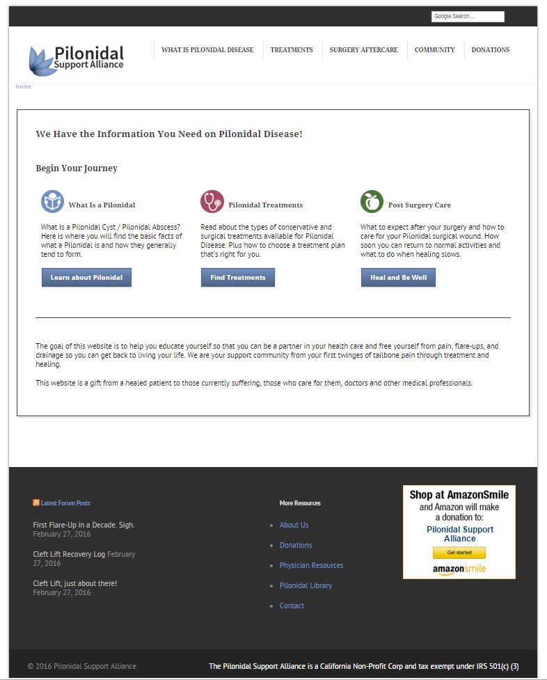
Then I looked at the content and broke it into the 3 main sections: Discovery, Action, Recovery. Once the content was sorted into an information architecture I started working on a style guide. All the information needed to be presented consistently across 58 pages of content, so once a user knew how the site worked they could apply that knowledge any where they went in the site.
After each page was styled, I did a deep dive into the content. Cleaning up copy, breaking longer paragraphs up into shorter bites. Making sure every word really needed to be there, and was the RIGHT word. Was I presenting ideas cleanly, in ways that users would understand them?
Since this a medical information site and the images are rather disturbing, I chose to use icons to designate sections on the user path.